How to draw a Rounded corners box ?
Many web developers in the past, places images instead of rounded corners , because the default appearance of the box borders pointed right-angled corners. But now the CSS3 border-radius property allows web designers to draw the rounded corners .
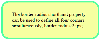
The border-radius shorthand property can be used to define all four corners simultaneously. If any value is set to zero, that corner will be square.
Source
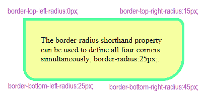
You can specify different values on each corner of the box.
output
CSS Rounded Corners In All Browsers
In Firefox you need to use the -moz- prefix, that functions the same way as the standard CSS version.

Inorder to set a different radius for each individual corner of your box, use like the following :
In order to set rounded corners properties in all browsers you can implement like the following:

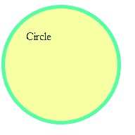
How to draw a circle using CSS ?
Copy and paste the following source code to your html page, it will draw a circle in your html page.
output
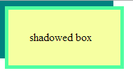
How to draw a shadowed box ?
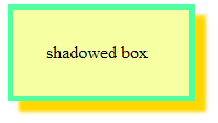
The box-shadow CSS property can be used to define shadow effects in a box element.
Syntax:
box-shadow: x y blur radius color ;
- x - specifies the horizontal distance on the right of the box.
- y - specifies the vertical distance above the box.
- blur - the shadow will be sharp, the higher the number the shadow becomes bigger and lighter.
- radius - Positive values will cause the shadow to expand and grow bigger.
- color - color of the shadow
example
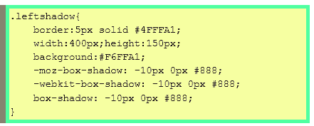
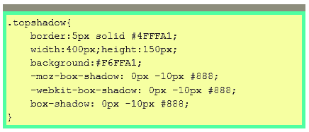
When you set the negative values in x and y the shadow will draw left and above the box.
In the above code the x and y set as negative values, so the shadow will draw on the left and above the box .
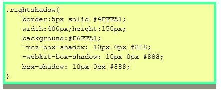
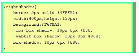
CSS Box shadow on one side
You can draw box shadow on one side using css
Shadow on bottom side
Shadow on left side
Shadow on right side
Shadow on top side
In order to set shadowed box properties in all browsers you can implement like the following: